
This week's topic at Top Ten Tuesday explores the cover trends that you like or dislike.
Visit The Broke and the Bookish for more lists.
Like
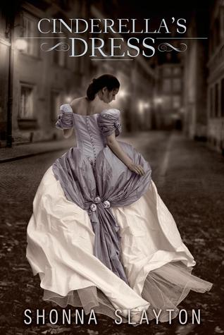
1. Pretty Dresses. I have seen this on a few dislike lists but I love them.


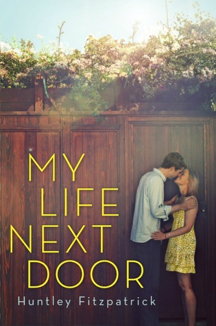
2. Sweet Couples.


3. Lovely Flowers.

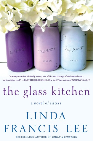

4. Vintage Items.
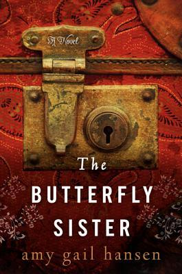


5. Headless Bodies. eee. That sounds morbid but I like when the face isn't shown. I picked up this trilogy at the library based on the covers.


6. Washed Out Photos.

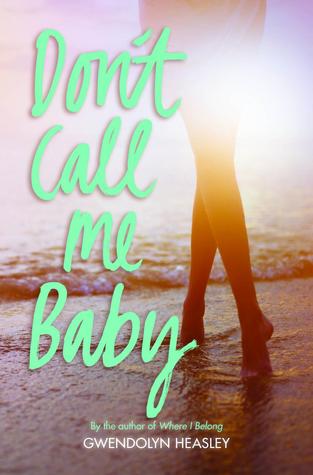
7. Colorful & Illustrated. I'm not really sure what style this is - I always think of it as "chick-lit-ish" but I don't think that is an accurate name.


8. Photo Props.


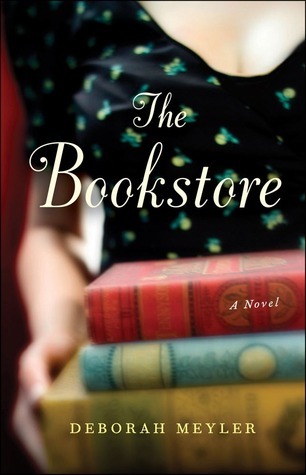
9. Reverse Shots.


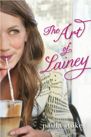
10. Facial Close-ups.

Dislikes - not as many on this list.
1. Bare-chested, tattooed males.
2. Dark, Hooded Figures. Usually found on Fantasy or Dystopian books. With those dark eyes that don't look nice.
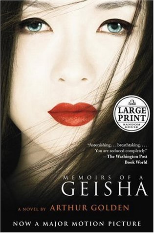
3. Historical, Thoughtful Women.

4. Ren at Words in a Teacup mentioned that she dislikes covers where the title doesn't flow in the standard reading order and I thought "YES! Me too!" I find this annoying in other printed realms as well.
What about you? Do you have a list for this week?
4 comments:
I like facial close ups if the person in the photo actually looks like the character. You know what I mean? I mean, obviously the Tim Tebow one looks like him. Haha. I haven't read The Art of Lainey yet but I want to. Hope the cover doesn't disappoint.
I don't mind dresses as long as they have some relevance to the story :)
I really like the washed out photo covers too! So pretty :)
I have to admit that almost all of your likes are on my dislike list, haha!But, for most, I have exceptions that I really love. The headless ones just bug me for some reason. I love vintage item covers, they always look so pretty. Great picks :)
You have really great picks and a bigger imagination than me, I had a hard time figuring this out!
Post a Comment